CASE STUDY
Wells Fargo Bank
Wells Fargo Bank produced a software application to help the loan application process better adhere to banking regulations by use of this loan processing app. The app was developed without UX input.
I was hired to:
- Socialize UX best practices and processes into the development environment
- Redesign an existing application to enhance the user experience
- Use the latest tools to ensure responsive design across desktop and tablets and manage ongoing UX defects

In the span of one year, I successfully completed my mission to:
- Socialize UX best practices and processes into the development environment
- Redesign an existing application to enhance the user experience
- Use the latest tools to ensure responsive design across desktop and tablets, and manage ongoing UX defects
Stakeholder interviews, contextual inquiry and online questionnaires were part of our discovery phase. Customer feedback was equally important in defining customized dashboards and content pages.
The original development team did not include a UX design process, nor were any user experience interviews conducted.
The software developed was based on process workflow as defined by the development team and business analysts.
This resulted in an application that was not intuitive nor easy to use or learn.
The software developed was based on process workflow as defined by the development team and business analysts.
This resulted in an application that was not intuitive nor easy to use or learn.

The Problem
The 10-Step Solution
- Socialize UX by educating software developers about what User Centered Design is with Brown Bag sessions
- Heuristic Review of application with report to management
- Start with minor UI improvements to establish competency and buy in from corporate stakeholders
- Introduce UX process and artifacts into the agile design process and requirements documentation
- End-user testing on existing software to establish baseline
- Task Flow analysis to identify gaps between functionality and user needs
- Create Personas based on end-user interviews and questionnaires
- Validate the new workflow and identify next gen development tools with a Proof of Concept
- POC Report results including time to completion, number of errors and customer satisfaction
- Create a new project artifact --the User Requirements Document (URD)
My first step was to ‘socialize’ UX best practices by educating all internal stakeholders about what User Centered Design means –from stakeholder interviews, personas and use cases, to wireframes, high fidelity prototypes and user testing.
This was accomplished through a series of virtual ‘Brown Bag’ sessions. These online real-time PowerPoint presentations broke down UX design into small chunks that were easily digested and remembered.
This was accomplished through a series of virtual ‘Brown Bag’ sessions. These online real-time PowerPoint presentations broke down UX design into small chunks that were easily digested and remembered.
Socializing UX

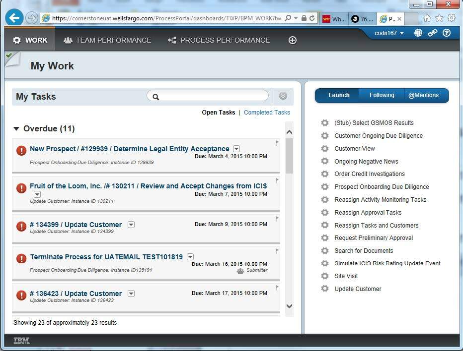
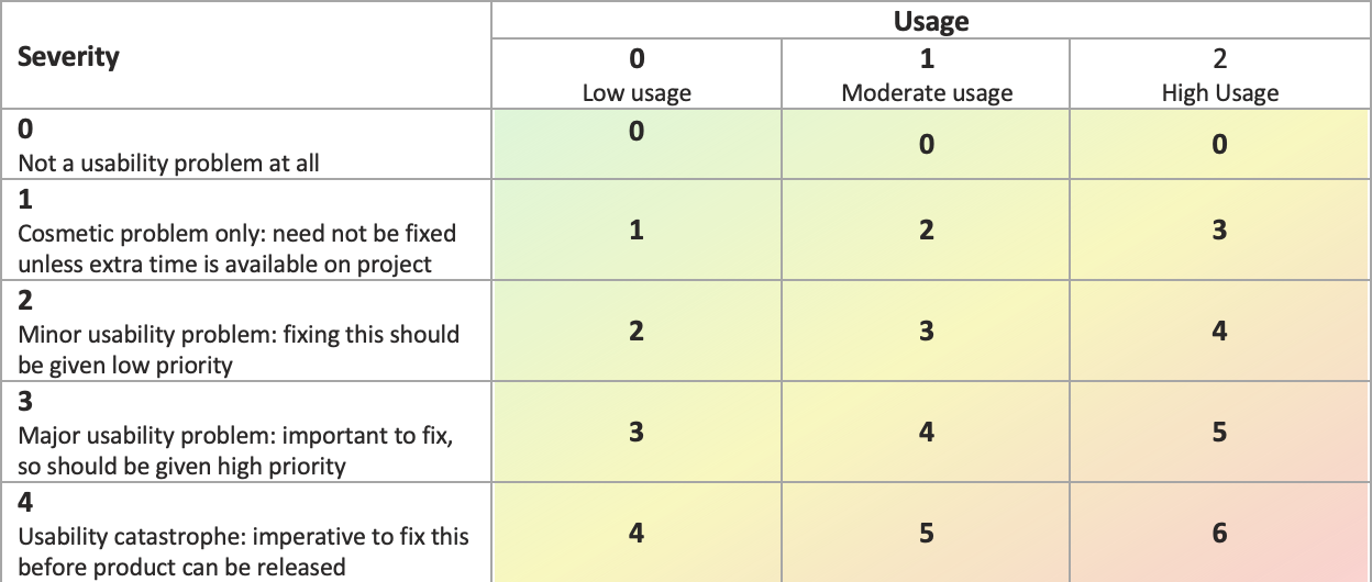
A heuristic review, or expert review, was conducted by judging the application against the basic principles of user interface design.
Each screen and component as well as the overall user experience was examined.
The result was a list of ‘low hanging fruit’ improvements to pick for the short term and the beginnings of the long-range plans for improving the UX.
Each screen and component as well as the overall user experience was examined.
The result was a list of ‘low hanging fruit’ improvements to pick for the short term and the beginnings of the long-range plans for improving the UX.
Heuristic Review

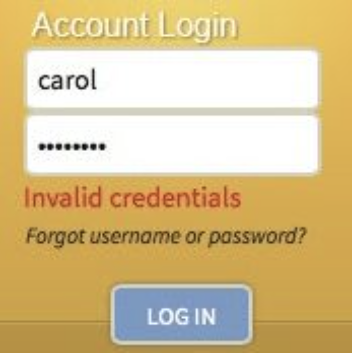
Adding an error message for invalid credentials is an example of some of the low hanging fruit that was addressed early on.
Introducing UX Processes into the Workflow
As with most large government regulated corporations, documentation and established processes are essential. I introduced UX processes and artifacts to help improve the workflow. The results included:
- Modifying the business requirements phase to include a UX review and annotated wireframes for every new feature added
- Modifying the technical documentation process to require review of annotated wireframes before tech specs were written and high-fidelity mockups before any coding took place
- Finally, I produced a Usability Test plan outlining test frequency, test methodologies, usability metrics, as well as reporting artifacts
A task-based script was created for users to follow during usability testing.
As the participants (loan officers) followed the script, I observed without intervening except when they became stuck and could not continue.
Task completion and time to completion were recorded and compiled.
A SUS survey was administered showing the perceived level of usability was well below average.
The deliverable was a report presenting test results and recommendations for next steps.
Usability Testing of Existing System
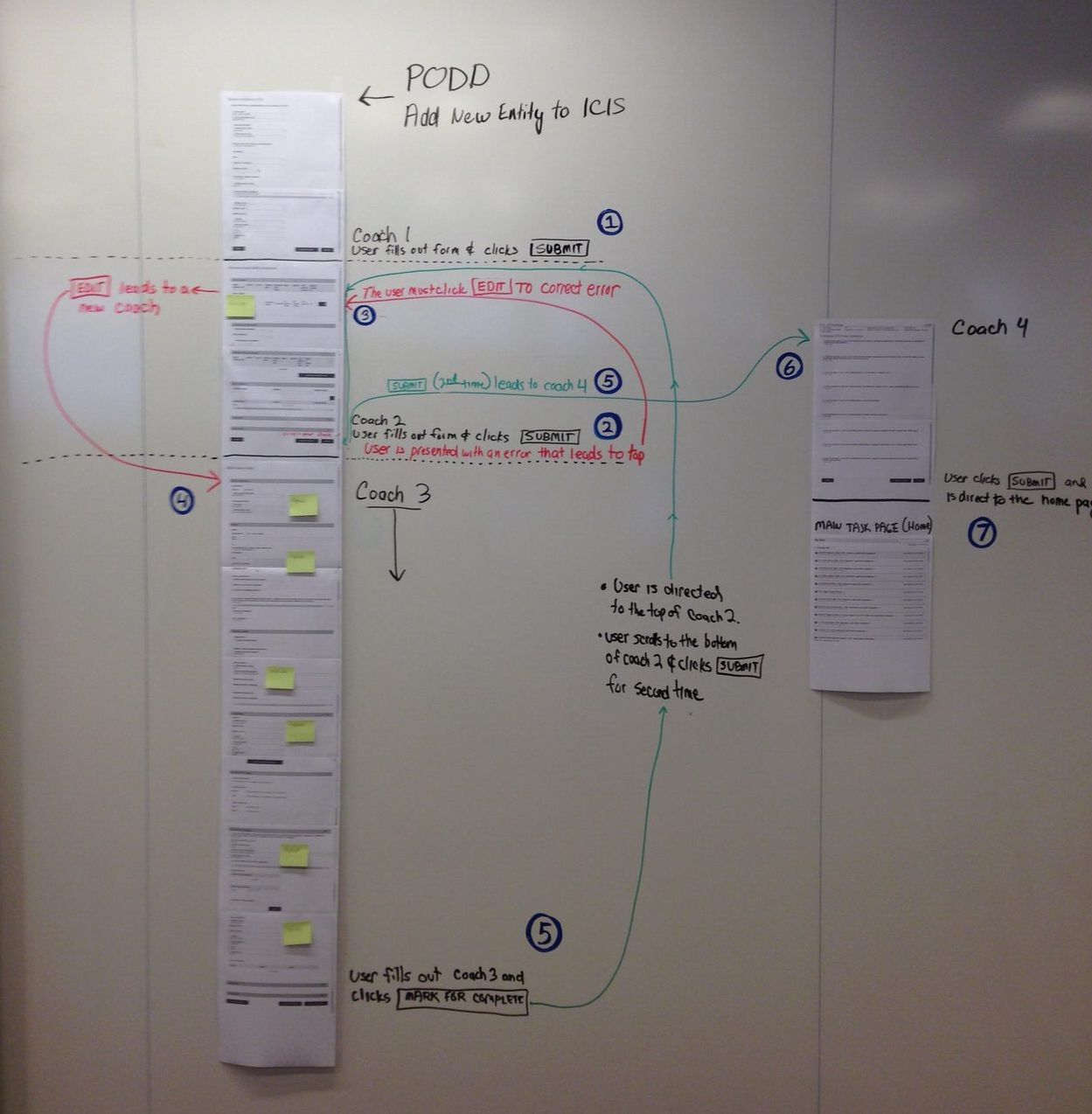
After observing users perform their tasks, I documented their taskflows.
Through careful examination of their current workflow and desired need for simplification, I created an optimal task flow.
From this analysis I identified over 40 mouse clicks and screens that could be eliminated from the user interface.
Through careful examination of their current workflow and desired need for simplification, I created an optimal task flow.
From this analysis I identified over 40 mouse clicks and screens that could be eliminated from the user interface.
Task Flow Analysis

Information gathered from user interviews, stakeholder interviews and online questionnaires helped me shape the personas.
Information included general user characteristics, user goals, pain points, technology skills, devices most used and other general observations.
The result was to restructure the application to have four dashboards, one for each main type of user based on the four personas developed. The user login and role would determine which dashboard was presented.
Defining the Users with Personas
The current software did not support mobile, despite being a user requirement. I was charged with validating other tools to bridge this gap, while testing the new workflow at the same time.
Using IBM Brazos, I created a proof of concept with two goals in mind:
The result was a resounding yes to both the new tool and newly revised task flow.
Using IBM Brazos, I created a proof of concept with two goals in mind:
- Build a working demo with the new tool to validate its claims and compatibility with Wells Fargo infrastructure
- Duplicate the usability test to validate the new streamlined task flow
The result was a resounding yes to both the new tool and newly revised task flow.
Identifying Next Gen Tools for Mobile
Wireframing Dashboards
With approval in place to proceed, the next step was to design the dashboards UI.
A template was created for the base dashboard to establish common UI elements. Dashboard UIs were then customized for each user group's needs.
Wireframes were tested with end users.
A template was created for the base dashboard to establish common UI elements. Dashboard UIs were then customized for each user group's needs.
Wireframes were tested with end users.
High fidelity prototypes of each dashboard type with a few click-throughs were created.
These prototypes were presented to and tested with end users.
These prototypes were presented to and tested with end users.
Prototyping
I introduced the ‘URD’ – the User Requirements Document. This documentation artifact was new to the software development plan and fit between the Business Requirements and the Technical Requirements. The URD contained new design patterns, task flows and annotated wireframes. The new process specified that technical specs could not be started without a URD first.
The result: no code was written without a UX/UI blueprint in place.
The result: no code was written without a UX/UI blueprint in place.
Creating User Requirements Document
