CASE STUDY
MeridianLink
Introduction
MeridianLink is a Southern California software company that provides a suite of products for the financial sector, specifically credit unions. One of their products, LoansPQ, integrates loan origination, core processing and internal banking software. I was hired as a UX Consultant for one year to address and resolve several issues with the application.
The current LoansPQ in-branch software is "legacy level" in regard to the UI and UX. This stems from the system being built in the early-to-mid 2000's; the system grew rapidly in both functionality and number of users.
Product development resources were primarily committed to reaching increasing client demands for additional functionalities and customizations. Consequently, the LoansPQ UX was in dire need of an upgrade.
“I get hammered on how ugly it looks and how not intuitive it is. It looks like 1989”.
Product development resources were primarily committed to reaching increasing client demands for additional functionalities and customizations. Consequently, the LoansPQ UX was in dire need of an upgrade.
“I get hammered on how ugly it looks and how not intuitive it is. It looks like 1989”.
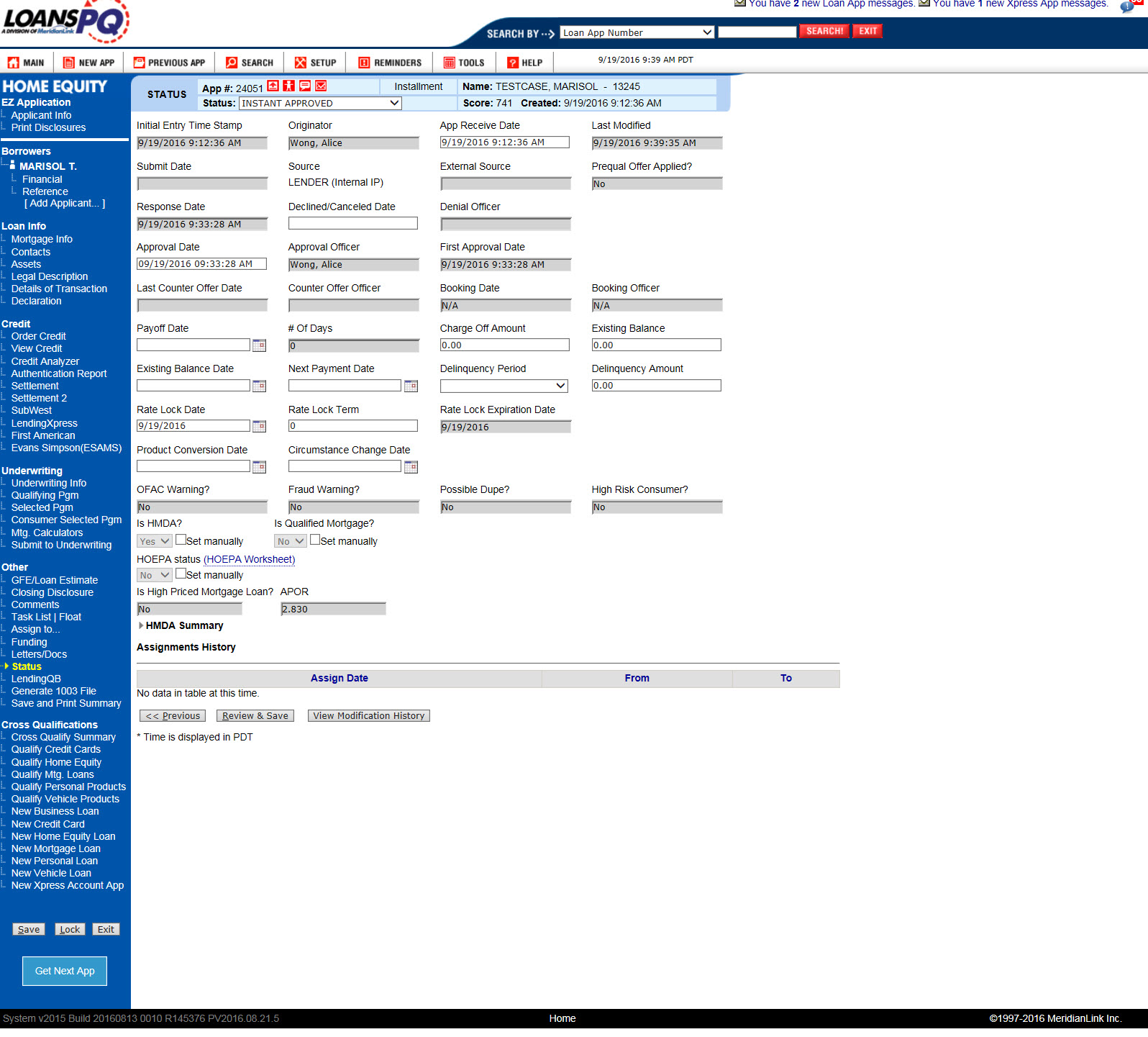
The Problem
MeridianLink asked me to take on the project of redesigning LoansPQ from the ground up. I proposed undertaking a three-phased approach which consisted of Discovery, Design and Test.
To that end, I methodically interviewed stakeholders, analyzed the feedback, created wireframes and prototypes and created a new paradigm for LoansPQ.
We successfully redesigned LoansPQ, iteratively testing with internal and external stakeholders, to create a streamlined and modern product.
To that end, I methodically interviewed stakeholders, analyzed the feedback, created wireframes and prototypes and created a new paradigm for LoansPQ.
We successfully redesigned LoansPQ, iteratively testing with internal and external stakeholders, to create a streamlined and modern product.
The Solution
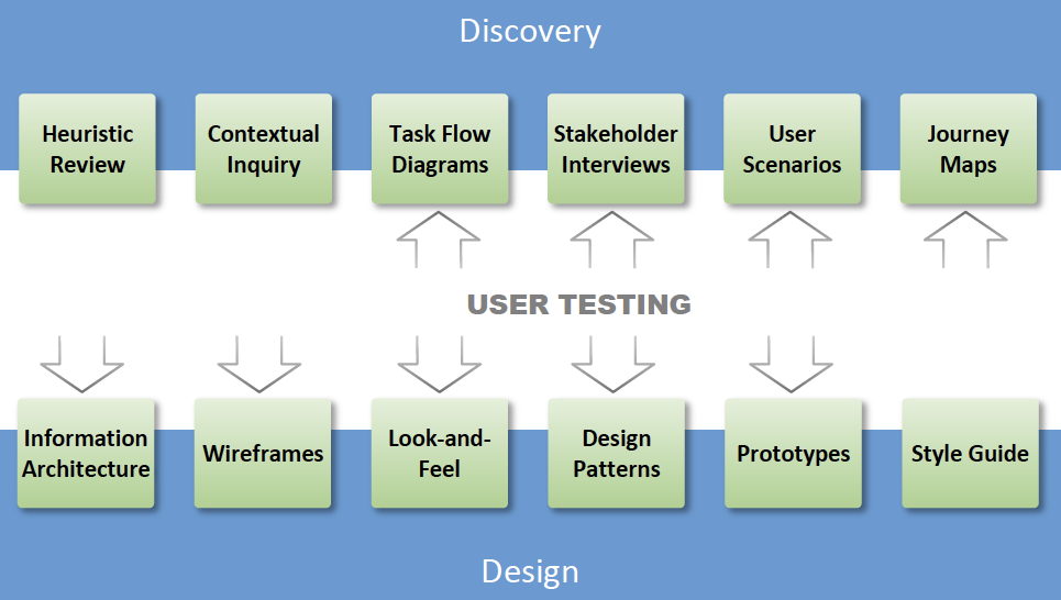
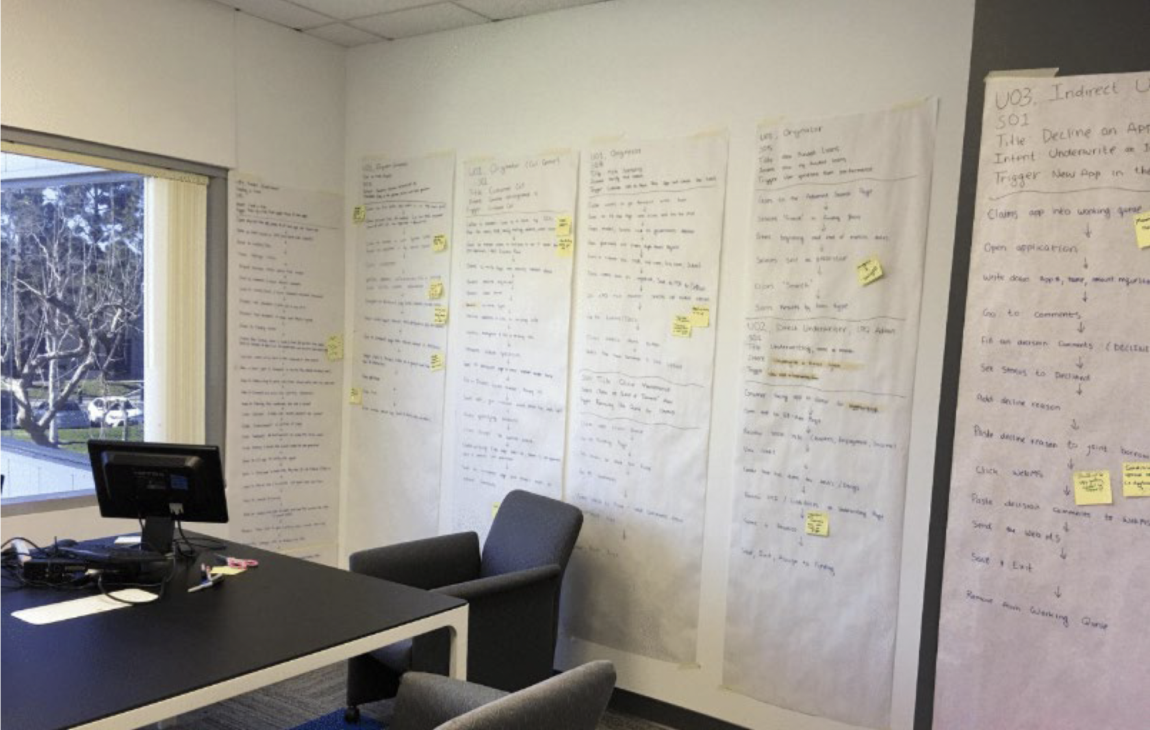
I performed contextual inquiries at three credit unions, all MeridianLink customers, over one week observing several end-user doing their day-to-day work.
Post inquiries, user task flows were committed to paper and pasted up for myself and stakeholders to review and discuss.
This yielded rich information on the task flow, leading to an understanding of the loan officers' goals, motivation and pain points.
Post inquiries, user task flows were committed to paper and pasted up for myself and stakeholders to review and discuss.
This yielded rich information on the task flow, leading to an understanding of the loan officers' goals, motivation and pain points.
Contextual Inquiry
Task flow diagrams synthesized the information gathered from the contextual inquiry and presented a visual representation of the day-to-day tasks the user employs.
There were several types of users and a task flow diagram was produced for each.
This allowed us to visually see pain points in the flow and highlighted areas for improvement in the process.
There were several types of users and a task flow diagram was produced for each.
This allowed us to visually see pain points in the flow and highlighted areas for improvement in the process.
Task Flow Diagrams
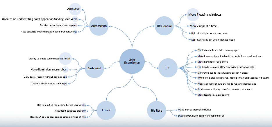
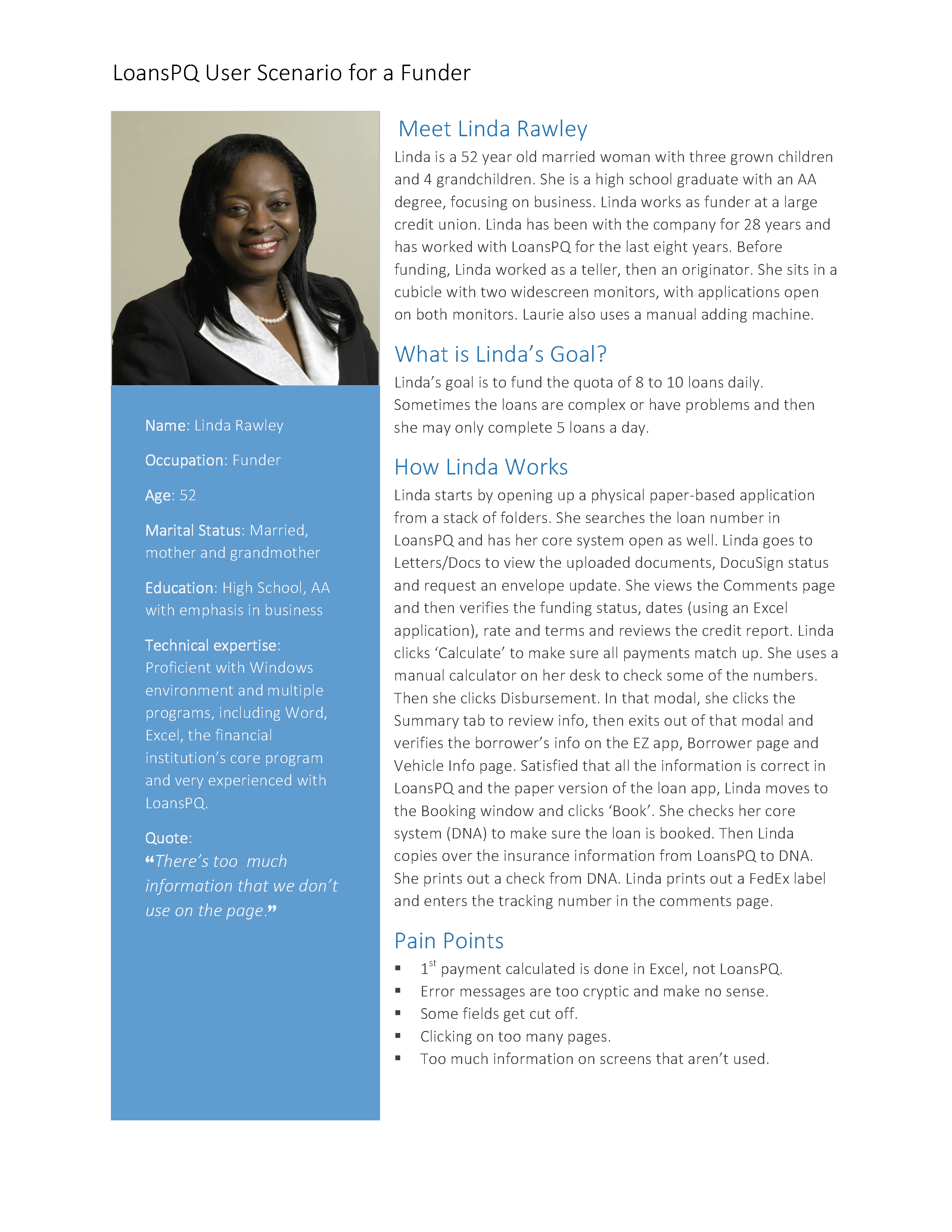
Stakeholder interviews were conducted with open ended questions, lasting one hour per user type.
It’s here that we found out what the end-user’s pain points are as well as the intentions and constraints experienced by the internal stakeholders.
The deliverable was a report with general recommendations for possible improvements to the user experience.
It’s here that we found out what the end-user’s pain points are as well as the intentions and constraints experienced by the internal stakeholders.
The deliverable was a report with general recommendations for possible improvements to the user experience.
Understanding Users with Stakeholder Interviews
A persona describes who the ‘composite’ user is, and how they use the system.
I created personas for each user type
to give a human aspect to the user – someone that we could all relate to.
Personas were shared company wide
to help developers, sales and marketing remember the people we were building systems for.
I created personas for each user type
to give a human aspect to the user – someone that we could all relate to.
Personas were shared company wide
to help developers, sales and marketing remember the people we were building systems for.
Defining the Users with Personas
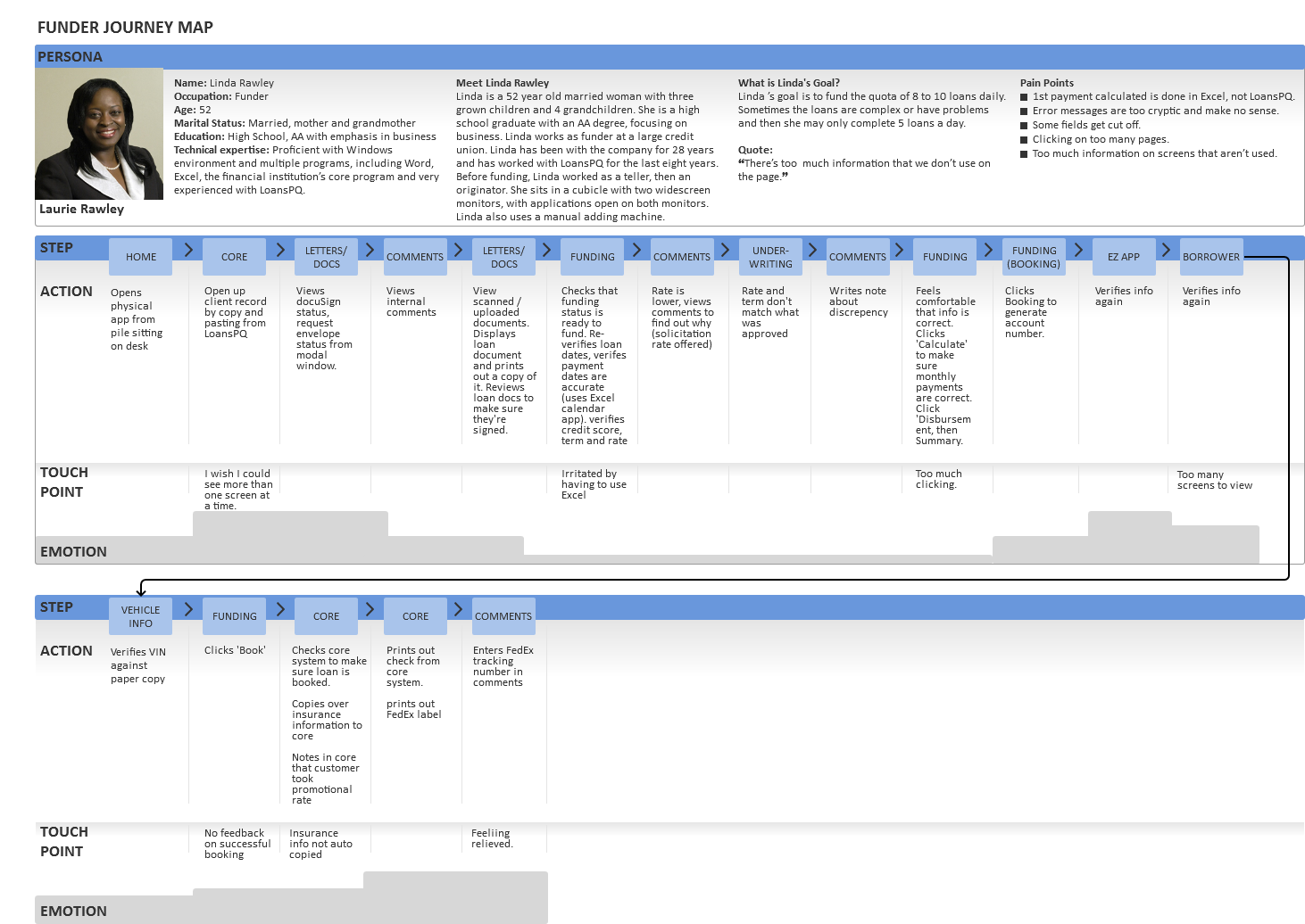
A journey map synthesizes personas, task flows, contextual inquiries and stakeholder interview highlights into one visual document.
This holistic view was invaluable towards understanding the users’ tasks, goals and emotions during their journey.
This holistic view was invaluable towards understanding the users’ tasks, goals and emotions during their journey.
Journey Maps - a Holistic View
A design pattern is a reusable solution to a design problem.
People, by nature, seek out patterns in everyday life – we are hard wired to do so. Why? Because recognizing patterns is an efficient way to make sense out of all the visual and audio input we process every minute. Patterns help us to formalize rules internally to interpret information we receive externally.
The purpose of this document was to define the commonly used patterns that make up the system so they may be repeated easily and provide for consistency in the application.
Creating the Design Pattern
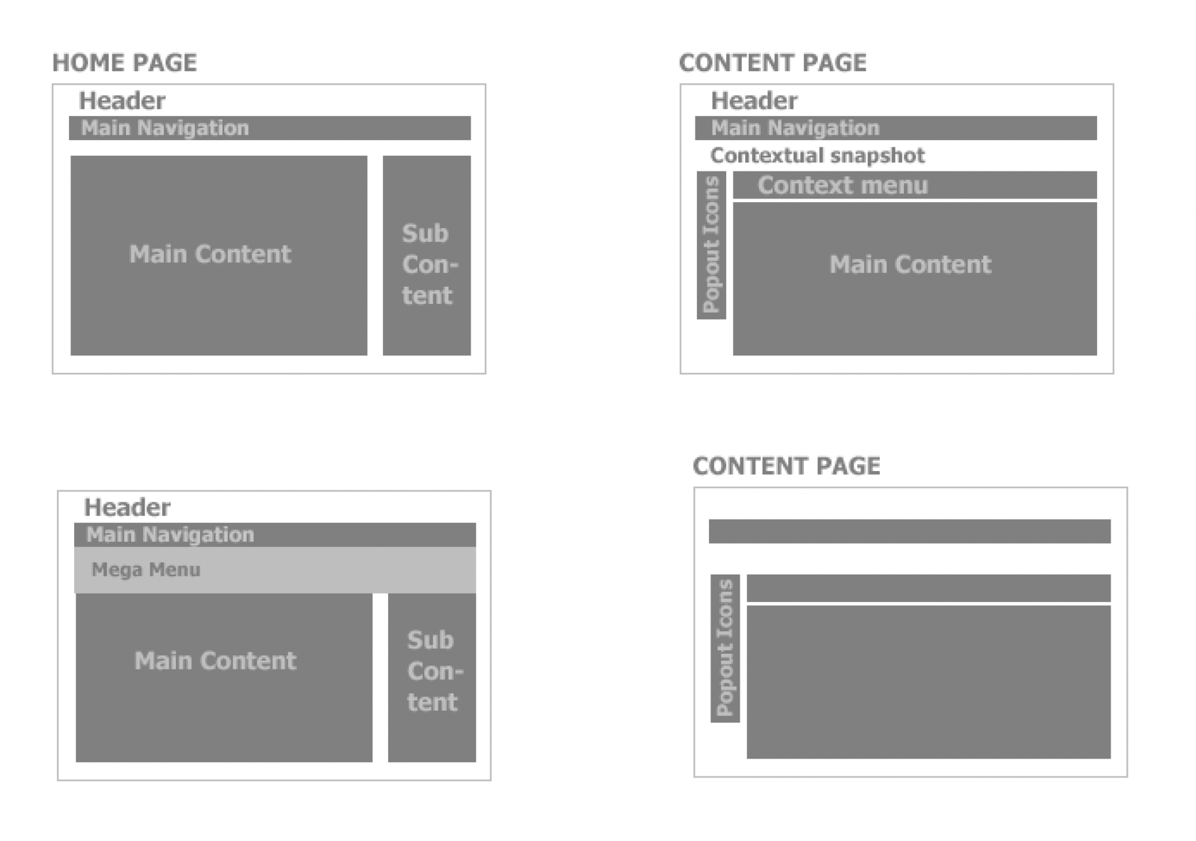
The wireframes centered on space allocation and prioritization of content, functionalities available, and intended behaviors.
Through these wireframes a pattern became clear maintaining the consistency that persisted throughout the application.
Through these wireframes a pattern became clear maintaining the consistency that persisted throughout the application.
Wireframing for Structure
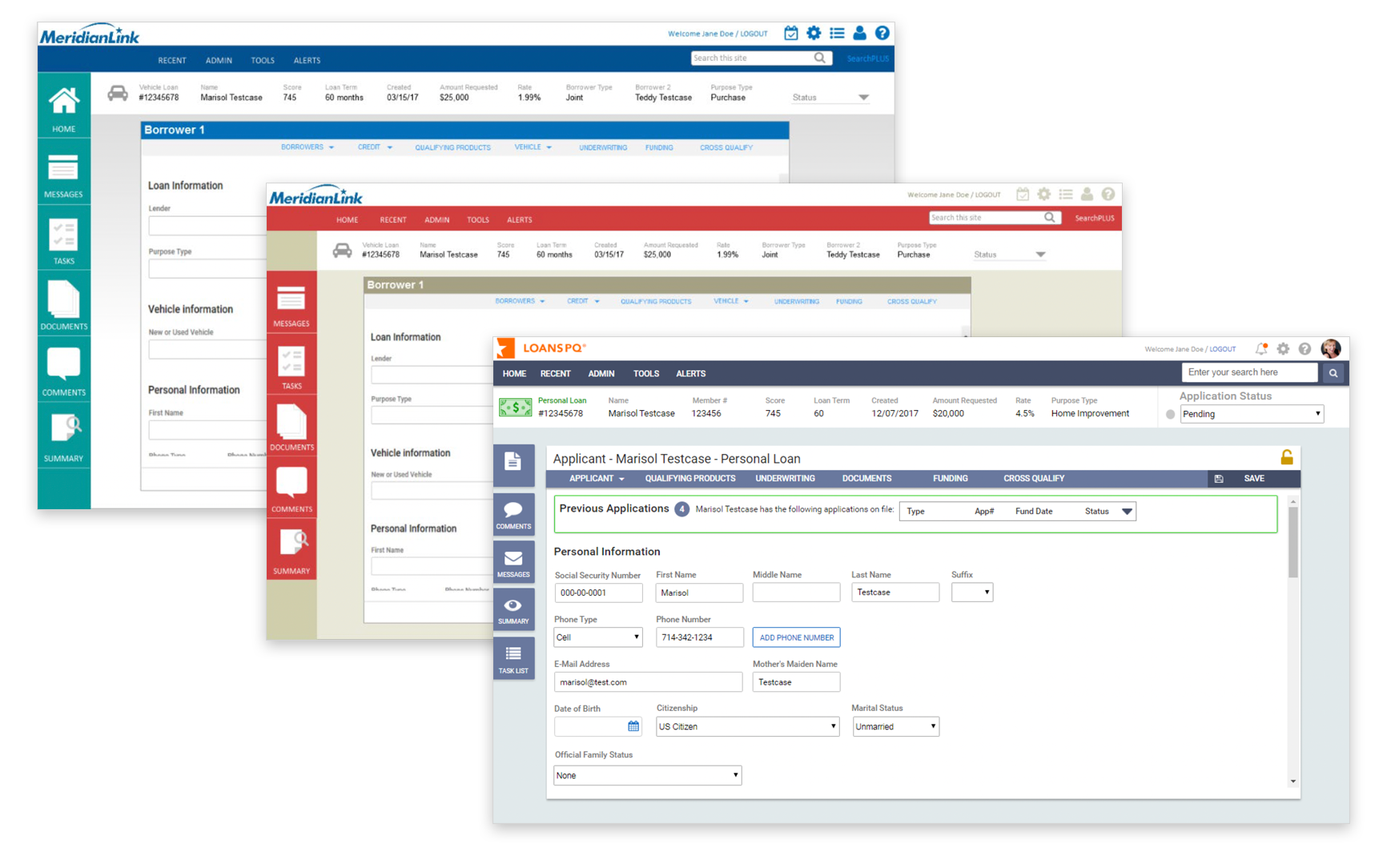
The visual design phase is where the design is fleshed out with a focus on color palettes, fonts, and graphical treatment.
This was an iterative design phase that was very popular with stakeholders as they saw the application begin to take shape.
A total of five visuals designs were produced initially and, after user testing one was selected.
This was an iterative design phase that was very popular with stakeholders as they saw the application begin to take shape.
A total of five visuals designs were produced initially and, after user testing one was selected.
Visual Design
Prototypes were developed using Axure and were fully functional.
The prototypes were used to uncover any problems and discover potential for improvement before any coding began by the development team.
Next, we were ready to test!
The prototypes were used to uncover any problems and discover potential for improvement before any coding began by the development team.
Next, we were ready to test!
Prototyping for Usability Study
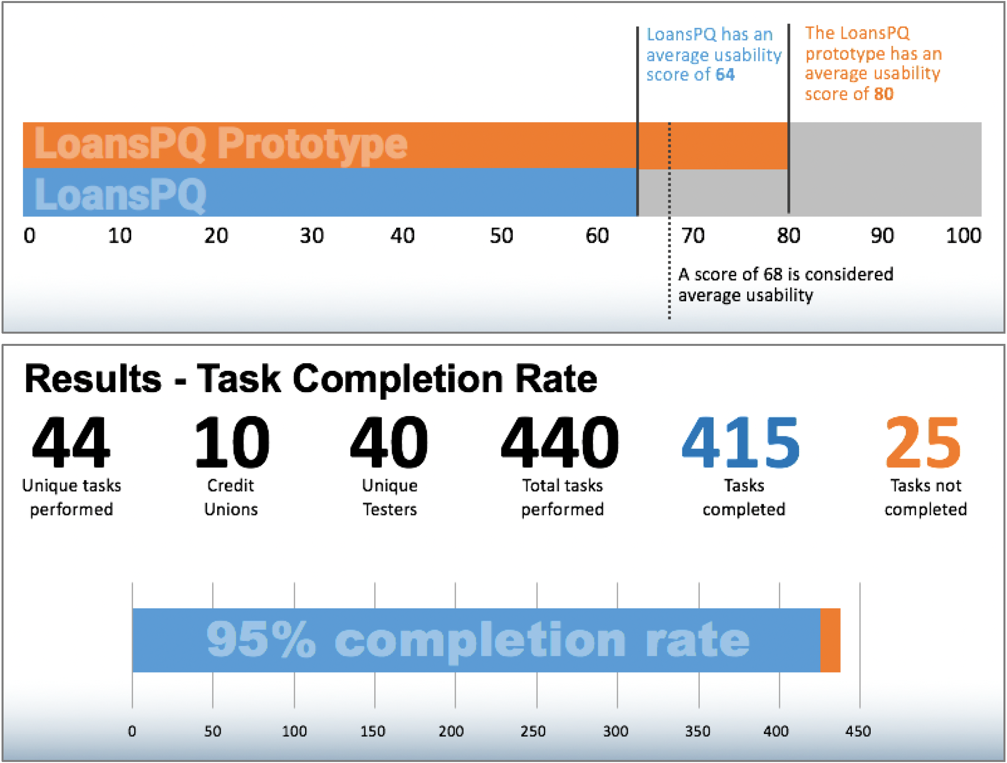
Several usability testing sessions were conducted on the wireframes and prototypes to gain insights into how the users regarded the new UI by gathering quantitative as well as qualitative data through testing and a SUS Survey.
MeridianLink and their customers were very excited about the new UI.
The new design achieved MeridianLink’s goals – redesign the product to be more user-friendly, easy to learn and more modern looking. Production began in Q2 2018.
MeridianLink and their customers were very excited about the new UI.
The new design achieved MeridianLink’s goals – redesign the product to be more user-friendly, easy to learn and more modern looking. Production began in Q2 2018.
Usability Testing for Results