CASE STUDY
Pacific Gas and Electric (PG&E)
Introduction
PG&E is an energy provider for Northern California. To maintain and protect their assets (like power lines and hydro dams) during an earthquake, they developed a web-based app called DASH. This app allows PG&E stakeholders to view estimated damages for their assets and to make informed response decisions based on the data they receive.
The DASH initiative was undertaken by PG&E in 2008 as a cooperative proof-of-concept development effort between the Hydro Generation Facility Safety Program (FSP) and the Geosciences Department.
The goal of this project was to develop a tool for creating fast, facility-specific reporting following significant earthquakes affecting PG&E dams.
The DASH system was later adapted and expanded to address Gas Transmission, Corporate Real Estate Strategy, Gas Transmission Stations and Gas Distribution facilities.
The DASH team was not gaining enough traction within PG&E to continue support for the project.
Technical constraints and usability issues were identified as the root cause of the problem.
If DASH was to serve as the “go to” tool for automated situational awareness, it needed to accommodate data from a diverse class of sensors and sources and display it back in a way that was intuitive and action-based.
The Problem
The solution was twofold:
This would include the following UX activities to achieve the goal:
- Update current DASH website for improved usability, employing user-centered design principles, and
- Create a separate admin desktop app fed from an application server to allow access via Graphical User Interface for web and mobile devices. Some DASH activities could only take place manually via database manipulation.
This would include the following UX activities to achieve the goal:
- User task analysis – understand the users' taskflows
- Information architecture – organize navigation and information in easily accessed format
- Visual design – create the branding for DASH that will carry across all platforms (web, mobile)
- Usability testing – Iterative design process to build and test in incremental steps.
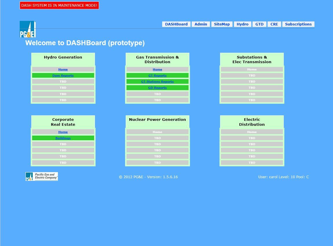
The Solution
I performed a series of stakeholder interviews within PG&E among the Geosciences department to understand their user scenarios in the event of an earthquake.
Several themes emerged – all stakeholders wanted to see DASH succeed and all had a major problem with the user experience.
The low perceived ease-of-use and ease-of-learning led to a lack of credibility in the DASH results.
Several themes emerged – all stakeholders wanted to see DASH succeed and all had a major problem with the user experience.
The low perceived ease-of-use and ease-of-learning led to a lack of credibility in the DASH results.
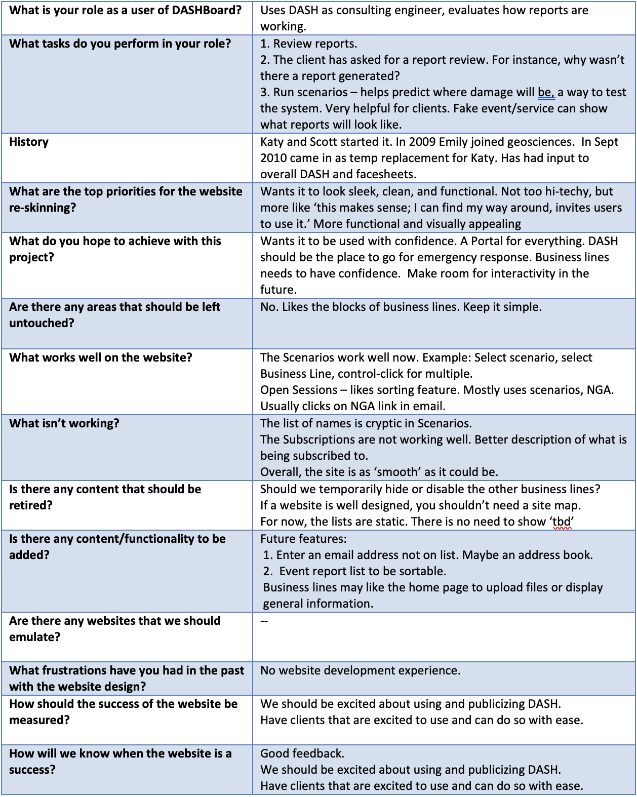
Stakeholder Interviews
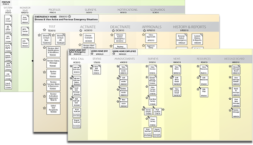
To better understand the intricate structure of the DASH user journey, task flow diagrams were generated.
These task flow diagrams provided a visual representation of the user's journey, making it easier
to understand the user's experience.
They helped identify potential issues in the user journey, such as confusing or frustrating steps.
By identifying potential issues, we were able improve the user experience by suggesting ways to streamline or simplify the user journey.
Task Flow Diagrams
The creation of detailed wireframes enabled us to envision how the intricate data set would be presented in the user interface.
Multiple rounds of wireframe iterations were tested with stakeholders, providing valuable insights into user attention and perception.
Multiple rounds of wireframe iterations were tested with stakeholders, providing valuable insights into user attention and perception.
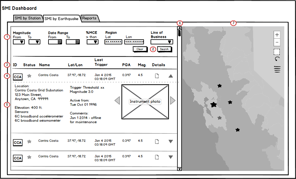
Wireframes
During the visual design phase, the design was further developed with an emphasis on color palettes, fonts, and graphical elements.
The iterative nature of this design phase was well-received by stakeholders, as they were able to see the application taking shape with each iteration.
A total of three visuals designs were produced initially and, after user testing one was selected.
The iterative nature of this design phase was well-received by stakeholders, as they were able to see the application taking shape with each iteration.
A total of three visuals designs were produced initially and, after user testing one was selected.
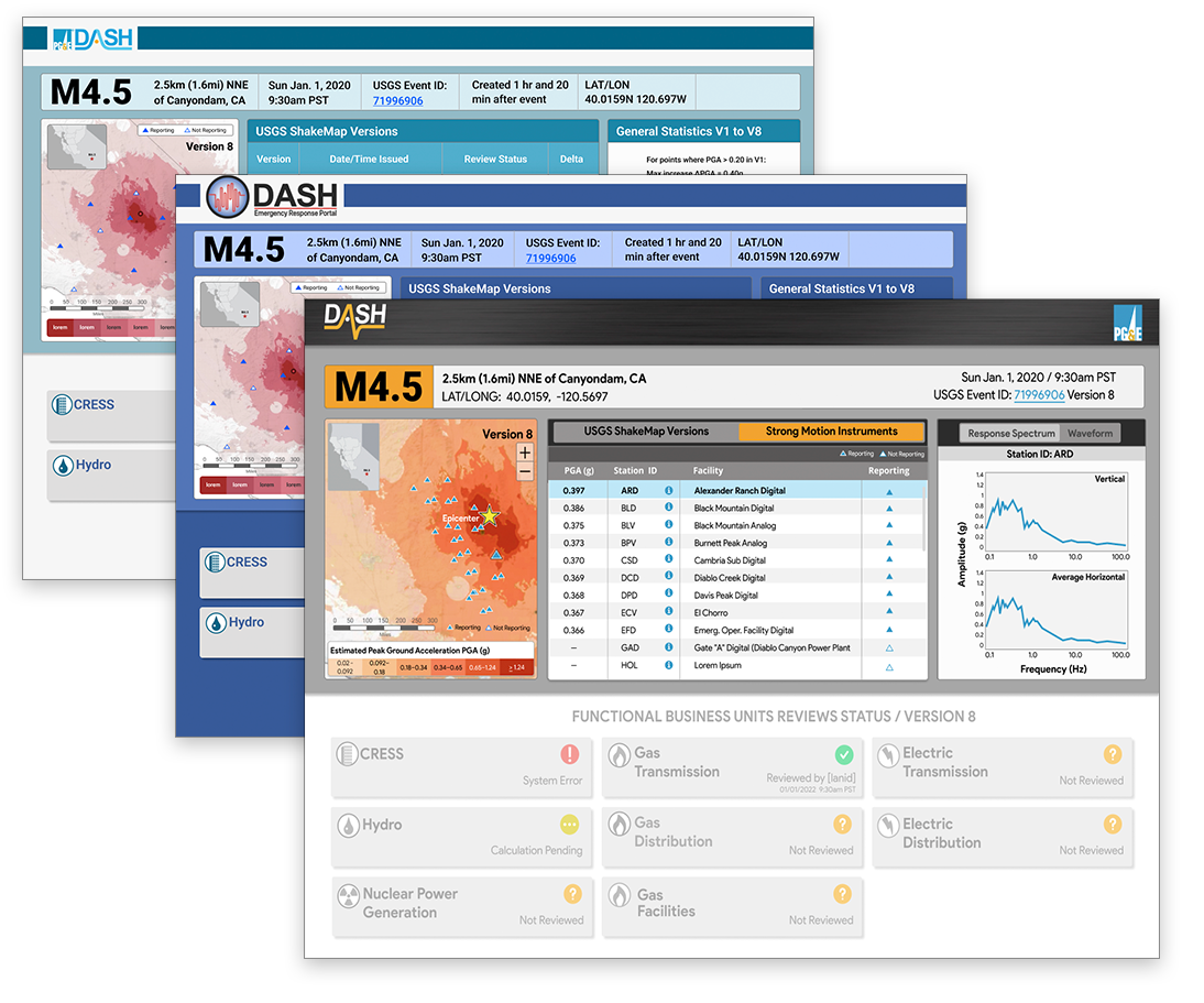
Visual Design
High fidelity prototypes were developed using Figma to test the interactivity of the display
This made it easier to gather feedback from stakeholders and users, and to test the usability of the design in a realistic setting.
This made it easier to gather feedback from stakeholders and users, and to test the usability of the design in a realistic setting.
Prototyping for Usability Study