CASE STUDY
Aural Analytics

Aural Analytics designed a digital application, Speech Vitals, that paves the way to early detection of neurological degeneration through subtle changes in speech that indicate potential disease.
For example, patients are asked to perform a series of tasks, like memorizing objects and reading sentences. It's a rigorous task set. Their recordings are analyzed and a set of results is produced.
By analyzing speech patterns on a user's recorded voice, a primary care physician can detect early Alzheimer's Disease and refer the patient to a specialist to create a treatment plan.
Speech Vitals is currently in clinical trials.
During the clinical trial period, patients must utilize the app on a weekly basis.
However, maintaining patient adherence has proven to be a difficult task as users often discontinue after a few weeks.
By conducting thorough research, design, and testing, an investigation into user objectives, motivations, and challenges will uncover enhancements that can effectively boost user compliance.

The Problem
Getting to Understand the Patient
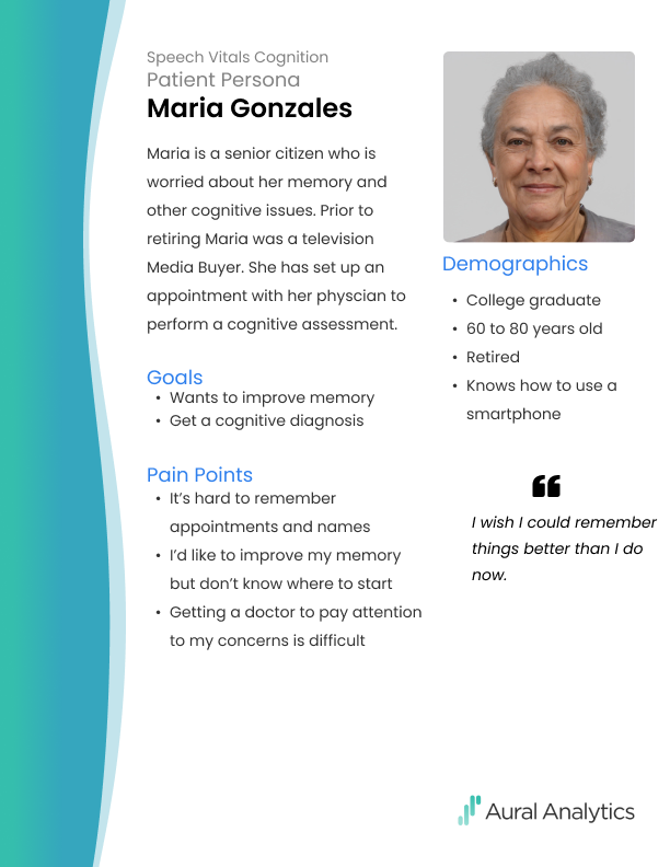
In order to obtain information about the patient experience, user interviews were carried out. The data collected on their goals, motivations, and pain points was then leveraged to develop a patient persona.
The persona facilitated a shared understanding of the patient among the development, analytics, and product teams, thereby strengthening our knowledge of the user experience.
The persona facilitated a shared understanding of the patient among the development, analytics, and product teams, thereby strengthening our knowledge of the user experience.
Establishing a Baseline in Usability
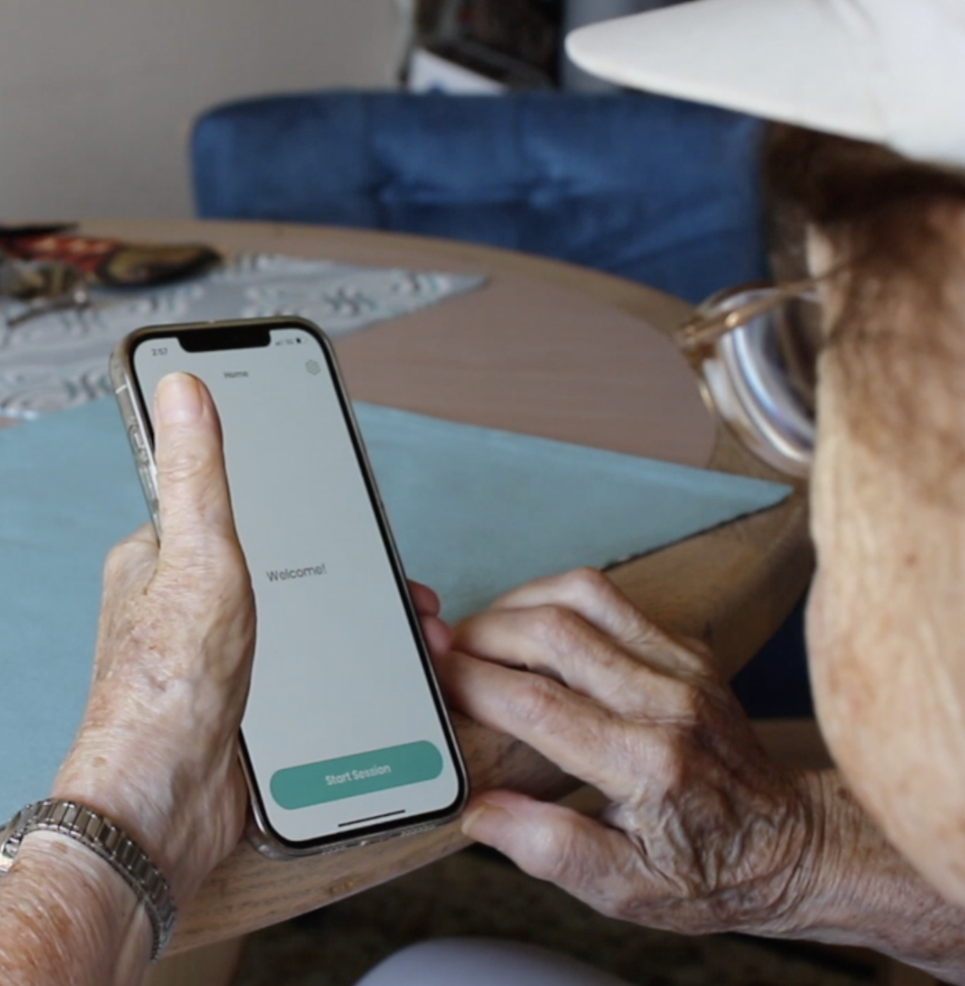
A usability test on the existing application was performed to establish a usability baseline. From this point on we could measure against the baseline to track our progress.
I had five target patient users perform the tasks while they talked aloud. Sessions were recorded and the participants were interviewed post test to uncover their pain points and gain insights into their behaviors and attitudes.
This test revealed several findings:
I had five target patient users perform the tasks while they talked aloud. Sessions were recorded and the participants were interviewed post test to uncover their pain points and gain insights into their behaviors and attitudes.
This test revealed several findings:
- Type was too small, lacked adequate contrast
- Touch targets were too small
- Users often could not tell when their voice responses were being recorded
- Users lost motivation or were discouraged during the session and so avoided using the app
The findings from the user interviews revealed some possible reasons why users did not stay in compliance with their weekly sessions.
I explored these findings to ideate on some possible solutions:
I explored these findings to ideate on some possible solutions:
- Increase readability by using larger fonts and enabling the program to respond to accessibility settings
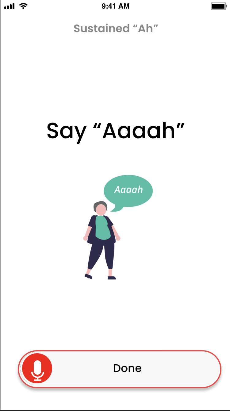
- Include illustrations to help convey concepts and increase user-friendliness
- Revise the recording indicator to better show when a recording was taking place
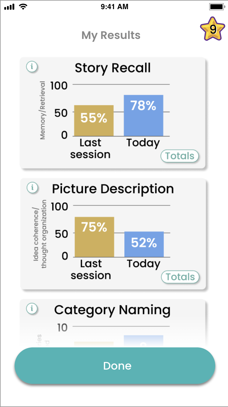
- Increase motivation with encouragement screens, badges and presenting task results
Designing and Testing Solutions



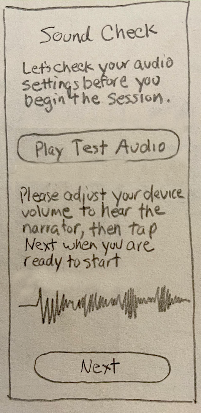
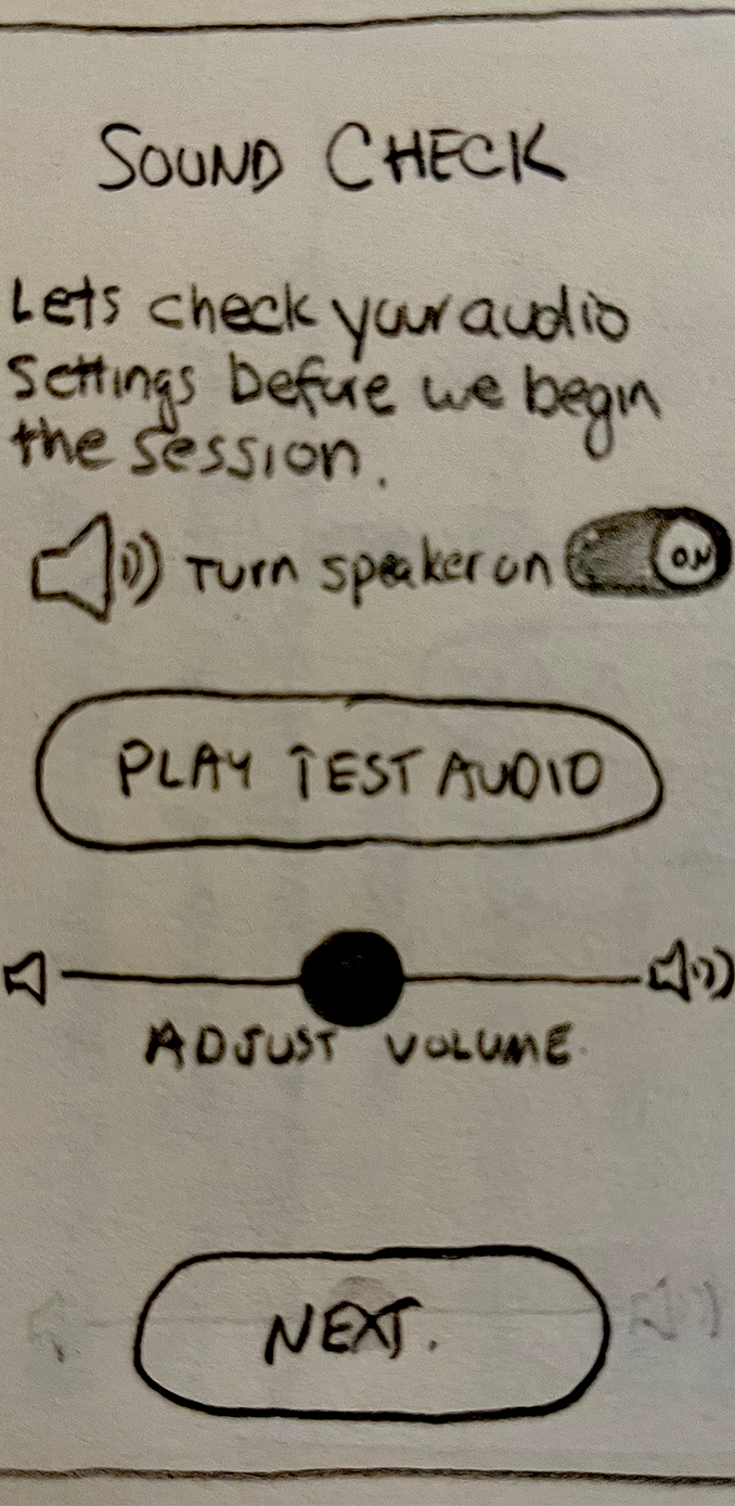
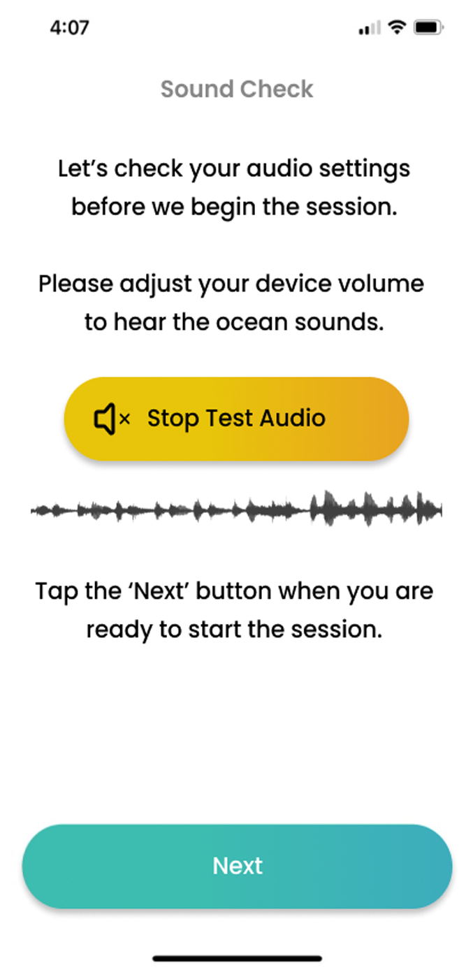
Over several usability studies, I validated the assumptions of improving compliance with the solution ideas outlined above.
Results showed us that:
Results showed us that:
- Users could read the screens more easily in large fonts mode
- Users responded favorably to the addition of illustrations
- The redesigned recording indicator was more easily understood than the original version
- Users did not respond well to earning badges by completing tasks
- Users were more motivated with the encouragement screens
- Users were eager to see their results
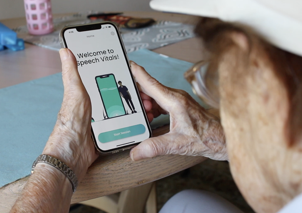
Testing Assumptions
For each usability study, a test report was generated to communicate findings to internal teams, including background, test results and recommendations for next steps.
As a result of these usability studies, large fonts and the new recording indicator were implemented.
As a result of these usability studies, large fonts and the new recording indicator were implemented.
Results of User Testing Sessions
Team Portal – The Speech Analyst Perspective
Team Portal is a web-based app that allows speech analysts to review the captured audio recordings from Speech Vitals
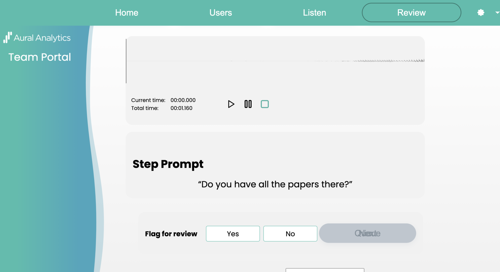
Team Portal is a tool for internal speech analysts to review and evaluate speech recordings from Speech Vitals.
As an internal-facing product, the UX/UI was left to developers. The speech analyst were experiencing considerable friction with Team Portal and needed an intuitive user experience to accomplish their goals.
As an internal-facing product, the UX/UI was left to developers. The speech analyst were experiencing considerable friction with Team Portal and needed an intuitive user experience to accomplish their goals.
The Problem

To understand the needs of the speech analysts and reviewers, I conducted several interviews. Key takeaways revealed their painpoints and frustrations.
User flows were created to illustrate the key actions to achieving their goals.
User flows were created to illustrate the key actions to achieving their goals.
Understanding the User
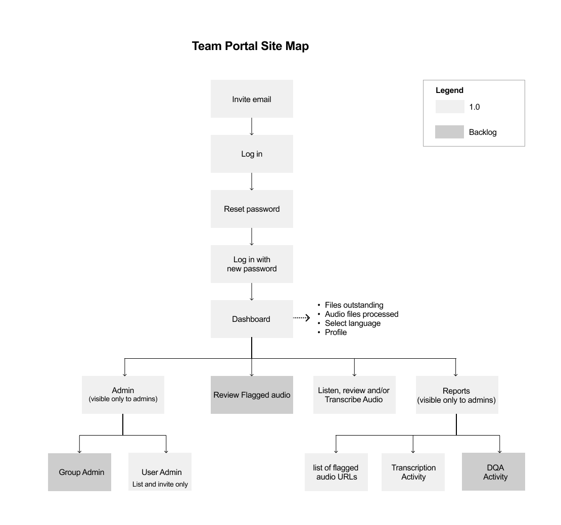
Establishing the information architecture played a pivotal role in comprehending the user's workflow dynamics.
Key red routes, were defined to cover essential actions like logging in, managing site access, and conducting thorough assessments of speech audio recordings.
Key red routes, were defined to cover essential actions like logging in, managing site access, and conducting thorough assessments of speech audio recordings.
Defining the Information Architecture
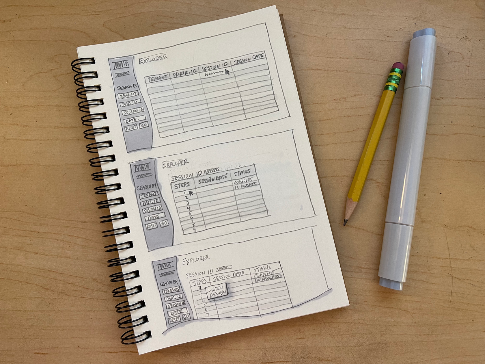
In order to swiftly explore a range of innovative ideas, I generated a collection of sketches that brought to life a multitude of diverse concepts.
These sketches served as a visual gateway, allowing me to engage in a process of imaginative exploration.
Sharing with the development team as well as stakeholders helped to narrow down the options to one design approach.
These sketches served as a visual gateway, allowing me to engage in a process of imaginative exploration.
Sharing with the development team as well as stakeholders helped to narrow down the options to one design approach.
Ideation through Sketching
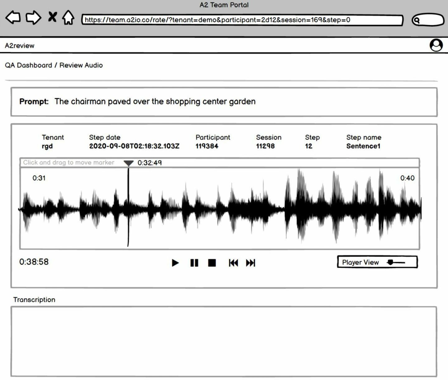
Detailed wireframes were developed to map out the user interface. This allowed me to visualize each of the screens' components, organizing the visual hierarchy to align with the user's needs and goals.
Several iterations were created after review by speech analysts and development teams, further refining and improving upon the design.
Several iterations were created after review by speech analysts and development teams, further refining and improving upon the design.
Mapping out the User Interface
Based on a final set of wireframes, high fidelity prototypes were developed in Figma to bring the concept to life.
A visual design was created to add interest and visual clarity, but at the same time not detract from the task at hand.
Prototypes were shared, carefully reviewed by the speech analysts and development teams and slated for development.
A visual design was created to add interest and visual clarity, but at the same time not detract from the task at hand.
Prototypes were shared, carefully reviewed by the speech analysts and development teams and slated for development.
Bringing the Vision to Life with Prototypes


